This was originally an internal presentation, but there was so much good content during my research for this, I’ve repurposed all my slide notes into this blog post.
The problem
The internet currently produces approximately 3.8% of global carbon emissions, which are rising in line with our hunger to consume more data. Increasingly, web technologies are also being used to sow discontent, erode privacy, prompt unethical decisions, and, in some countries, undermine personal freedoms and the well-being of society. - https://sustainablewebdesign.org/
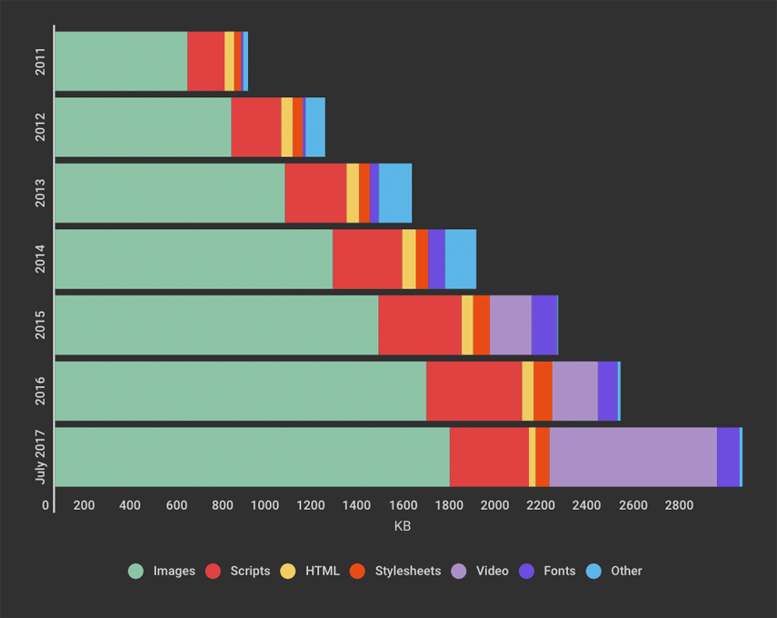
The average web page size now stands at around 2MB.
Notion infamously celebrated how they go their marketing page down from a whopping 12.5Mb to 3MB, which just goes to show how low the bar is right now making small website. - https://notionrealized.com/blog/migrating-notion-marketing-to-next-js.
It’s a simple as this - large bloated websites will generally lead to poor performance for users on slower connections and use more CPU and energy which is bad for the environment.
- more bytes === more code to parse / data to transfer
- more code to parse === more CPU usage
- more CPU usage === more energy
Therefore anything we can do to try and reduce our website size will be beneficial for the environment.
According to online carbon calculator Website Carbon, the average website produces 1.76g of CO2 for every page view; so a site with 100,000 page views per month emits 2,112kg of CO2 every year.
The more complex a website is, the more energy it requires to load – and the greater its climate impact.
Strategies for making more environmentally friendly sites
Use a green host
According to Greenwood, one of the most effective ways to reduce a website’s carbon footprint is to switch to a green web host - https://www.wired.co.uk/article/internet-carbon-footprint
Green hosts are hosting company whose operations are powered by renewable energy
A couple which I have found:
- https://www.greengeeks.com/
- https://www.greenwebhost.net/
- https://www.a2hosting.com/
- https://www.hostpapa.com/green-web-hosting/
Unfortunately green hosting still seems like it quite a niche. We also would lose the ergonomics of hosting on AWS / Vercel, Netlify.
Though AWS have made pretty bold claims they are working to towards powering all their operations to 100% renewable energy by 2025 https://sustainability.aboutamazon.com/environment/the-cloud?energyType=true .
This may or may not be a marketing ploy, I guess we just have to watch this space .
Be smarter with images
Byte-for-byte , images are the single largest contributors to page weight. Here are a list of sub strategies for optimizing our sites images.
https://blog-img.speedcurve.com/img/page-bloat-2-2011-to-2017.png
1. SVGs over Raster images
For simple illustrations, SVGs should be favoured over raster images e.g. JPEG, PNG and GIF . firstly SVGs just scale better and look sharper on all resolutions due to fact their vector based.
Bonus: optimise your SVGs with https://jakearchibald.github.io/svgomg/
2. Optimise your images
Sometimes we have to use raster images.
https://squoosh.app/ is a amazing tool built by the same person as SVGOMG.
There is also a CLI, so in theory we could automate it’s process https://github.com/GoogleChromeLabs/squoosh/tree/dev/cli
New picture formats such as avif and webp can be dramatically smaller than jpegs and pngs but they’re not supported on browsers.
This is how you can progressively enhance out sites for new formats, if the clients browser does not support it :
<picture>
<source srcset="img/photo.avif" type="image/avif">
<source srcset="img/photo.webp" type="image/webp">
<img src="img/photo.jpg" alt="Description" width="360" height="240">
</picture>3.Lazy load images
i.e only download the image when it comes into view https://web.dev/lazy-loading-images/. The loading attribute is supported out the box on all modern browsers and even works on iframes .
<img src="image.jpg" alt="..." loading="lazy">
<iframe src="video-player.html" title="..." loading="lazy"></iframe>
https://developer.mozilla.org/en-US/docs/Web/Performance/Lazy_loading https://caniuse.com/?search=lazy
Worth noting, we could also achieve a similar effect using JS using the browsers IntersectionObserver API.
4. next/image
All the above is actually quite a lot of work. So big shout out to next/image which does all the above auto-magically for you! we’re using this for Penso. With great results

Less JavaScript
This is a hard problem. But it’s getting easier.
great talk about the cost of JS - https://medium.com/@addyosmani/the-cost-of-javascript-in-2018-7d8950fbb5d4
Too much js can impact TTI (time to interactive) it cost energy to parse code, more importantly it will have negative impact on UX
Some sub-strategies for this:
Consider smaller library alternatives
A good tool for evaluating npm package sizes is https://bundlephobia.com/
for example:
-
day.js is 2kb alternative to moment.js(71.91kb)
-
react motion is 4.8kb alternative to react-spring(55.04)
-
preact is 3kb alternative to react(120kb)
- Recently I’ve had some success swapping out React for Preact . swapping-react-for-preact-in-nextjs
You can see that when we’re not mindful of the package sizes they can add up fast.
Code-splitting & Tree shaking (Dead code elimination)
A must in modern front-end development. Fortunately most frameworks has configured webpack/rollup to do this for us automatically.
Tree shaking
when we import our modules using ES module syntax like so:
import { capitalize } from "lodash";✅ do this

import _ from "lodash" ❌ not this
Our build tools know to only import that function and not the entire lodash lib.
Code-splitting
This is the process of chunking up our JS bundles into smaller packages .
For example, next.js is smart enough to split our js bundles into chunks per page, we can see this in our terminal when we build a next.js app
Page Size First Load JS
┌ ○ / 2.16 kB 83.7 kB
├ /_app 0 B 81.5 kB
├ ○ /404 194 B 81.7 kB
├ ○ /about-us 2.16 kB 83.7 kB
└ ○ /contact 2.17 kB 83.7 kB
+ First Load JS shared by all 81.5 kB
├ chunks/framework.895f06.js 42 kB
├ chunks/main.4fc506.js 23.6 kB
├ chunks/pages/_app.4c6d02.js 15.1 kB
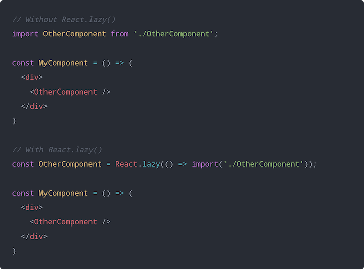
└ chunks/webpack.fb7614.js 770 BSometime it might be necessary to split code on component level, to lazy-load our component just like how we can lazy-load our images. Here’s an example of how might look in an react app:
Taking another look at our tech stack
Let’s take a step back though.
The rise in large website sizes is directly correlated to when client side rendering libraries like Angular, React and Vue started becoming very popular, roughly between 2010 until now. Though not the cause of bigger websites per se, we are definitely shipping more JS than we used to.
The last decade in web development there has been trend push more logic state to the client side and there has been a rise in making thick client apps similar to how mobile apps work. Mainly because we are demanding more from our website to feel more ‘app-like’. Just see Gmail, Figma. etc.
This is where these modern frameworks really shine as they make our lives as developers so much easier. It’s really hard to go back imperative DOM manipulation now that we’ve seen we’re all used declarative component based UI development.
The problem is not all website are web apps. So should they be like one?
This the crossroad between DX (developer experience) and UX (user experience).
Should the end user take the cost of loading bigger websites just because we cant be bothered to develop it in a more efficient way.
No, the answer is always no.
So, can we have our cake and eat?
Fortunately, the trend of very heavy client side app seems to be swinging back the other way and SSR techniques which PHP popularized way back is starting to make a resurgence but augmented with all the lessons we’ve learnt in the last decade of component based UI development.
I really like this article titled ‘The Third Age of JavaScript’, where the author talks about how we’re potentially entering new age tooling.

I’d want to highlight some new emerging technologies that will help us build more efficient websites.
React Server Component
React Server Components (RSC) are components that run on the server 🤯
It solves two big challenges:
- waterfall data fetching
- offloading frontend deps to the backend so the client doest take the hit.
React Server Components (RSC) are similar to server-side rendering (SSR) but they work slightly differently.
SSR is when a react component is first rendered on the server and HTML is sent to browser. Then React can take via a “hydration process” and the app behaves like an SPA.
RSC will only send back HTML to the client without any JS bundle a
Astro.js
Astro.js is popularising a technique called ‘Islands’. This is the idea that our website are comprised of little islands of interactive blocks. They’re asking the question, what if these little islands could have their own strategies? Such as, can loading of the interaction be delayed until when the component is in view? or when the CPU is free?
Svelte
Svelte is taking a radical approach and trying to compile away as much JavaScript as possible. The result is the ability to build rich user interfaces with much smaller JavaScript payloads.
Final remarks
There is not a satisfying conclusion to this unfortunately. The reality is that creating highly optimised web experience is hard and requires us to all be collectively mindful in the way we’re designing and building. With tight deadlines and customers to appease you can see why corners may need to cut and we end shipping more bloat than we would like. However, I’m confident that the innovations that are happening in our tool chain is going to carry on getting better and help us out more and more. That being said, we still have our part to make sure we’re all informed of the optimisations that are happening and I hope these notes help, even if just a little.
References
- https://sustainablewebdesign.org/
- https://css-tricks.com/reduce-your-websites-environmental-impact-with-a-carbon-budget/
- https://www.speedcurve.com/blog/web-performance-page-bloat/
- https://www.swyx.io/js-third-age/
- https://developers.google.com/web/fundamentals/performance/optimizing-javascript/tree-shaking/
- https://blog.logrocket.com/lazy-loading-components-in-react-16-6-6cea535c0b52/
- https://reactjs.org/blog/2020/12/21/data-fetching-with-react-server-components.html
- https://medium.com/@addyosmani/the-cost-of-javascript-in-2018-7d8950fbb5d4
- https://www.wired.co.uk/article/internet-carbon-footprint
- https://vwo.com/blog/reduce-website-carbon-footprint/
- https://kinsta.com/blog/zero-carbon-websites/